The Most Overlooked Part of Book Design: The Book Spine
When it comes to designing a book, the spine is often overlooked. However, it plays a crucial role in both the aesthetic appeal and functionality of a book. A book's spine is not just a physical necessity; it's a crucial component in the book's overall visual identity. Whether you're an author self-publishing your first novel or a seasoned publisher, understanding the nuances of

Key Functions of a Book Spine
- Identification: The spine typically carries the book's title, author's name, and publisher's logo, making it easy to identify among other books. This information serves as a mini billboard for the book, conveying crucial details at a glance.
- Aesthetic Appeal: A creatively designed spine can intrigue potential readers and encourage them to take a closer look. It's an opportunity to showcase a bit of the book's personality and entice potential readers with visual cues.
- Structural Integrity: The spine holds the book together, ensuring durability and ease of use. Without a well-constructed spine, the book may fall apart, compromising the reader's experience and the book's longevity.
Elements of Book Spine Design
Designing a
Title and Author Name
The title and author's name are usually the most prominent features on the spine. They should be legible and appropriately sized to ensure visibility from a distance. This visibility is crucial in crowded retail environments where books compete for attention.
- Font Choice: Use a font that aligns with the book's genre and cover design. For instance, a fantasy novel might use a whimsical font, while a thriller might opt for something bold and stark. The font should complement the book's theme and resonate with the target audience.
- Font Size: Ensure the font size is large enough to be read easily but not so large that it dominates the spine. Balance is key, as you want to maximize readability without sacrificing aesthetic harmony.
Publisher's Logo
If applicable, the publisher's logo is usually placed at the bottom of the spine. It acts as a mark of quality and can influence a reader's decision. The logo serves as an endorsement of the book's content and production quality, often swaying buyer decisions, especially among loyal customers of the publisher.
Color Scheme

- Contrast: Use contrasting colors to make the text and elements pop. This helps in increasing visibility and draws the eye to the spine, even from a distance.
- Consistency: Ensure the colors align with the overall theme and branding of the book. Consistent color choices help in reinforcing the book's identity and can evoke specific emotions or associations in potential readers.
Book Spine Layout
The layout of a
Spine Width
The spine's width is determined by the number of pages and the thickness of the paper. This measurement is crucial as it affects how much space you have to work with for design elements. A well-proportioned spine ensures that all elements are visible and aesthetically pleasing.
- Calculating Spine Width: Most publishers provide a formula or calculator to determine the spine width based on the page count and paper type. This calculation is essential for creating a spine that fits perfectly and looks professional.
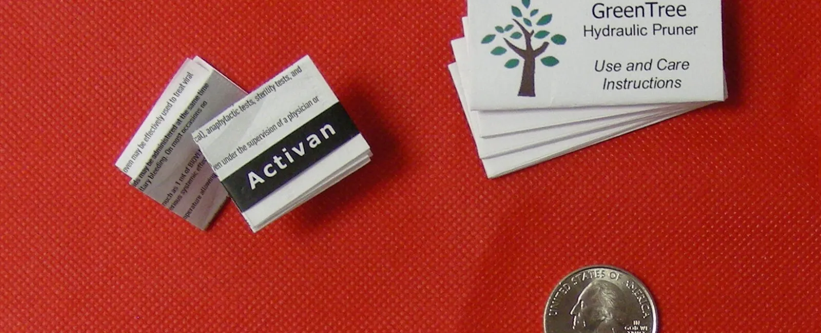
- Considerations for Thin Books: If a book is too thin, you may not have enough space for text on the spine. In such cases, focus on making the front and back covers more eye-catching. Alternatively, consider creative solutions like vertical text or even omitting text to maintain visual appeal.
Alignment and Orientation
Text alignment and orientation are crucial for readability and aesthetics. Proper alignment ensures that the text is easy to read and visually balanced, enhancing the overall design.
- Vertical Text: Most spines feature vertical text, which allows for easier reading when the book is shelved. This orientation is standard across many regions and is expected by readers.
- Centered Text: Center the text for a balanced look, ensuring it doesn't appear cramped or off-center. A well-centered text contributes to a clean and professional appearance, enhancing the book's marketability.
Tips for Creative Book Spine Ideas
Creating a spine that captures attention is an art. Here are some tips to spark your creativity and ensure your spine stands out in a competitive marketplace:
Experiment with Typography
Typography can set the tone for your book. Consider using unique fonts or arranging text in an unexpected way to draw the eye. Creative typography can convey mood, genre, and even the book's theme, providing a sneak peek into the book's content.
Incorporate Imagery

If space allows, incorporating small images or patterns can add an extra layer of intrigue. This might include symbols, motifs, or even a small section of artwork from the cover. Imagery can provide additional context or thematic elements, enriching the visual appeal of the spine.
Utilize Special Effects
Consider using special printing effects like embossing, foil stamping, or UV coating to add texture and shine to the spine. These effects can make your book feel premium and catch the light in interesting ways. Such enhancements not only make the spine more visually engaging but also create a tactile experience for potential buyers.
Common Mistakes to Avoid
While designing a
- Overcrowding: Avoid cramming too much information onto the spine. Simplicity often has a stronger impact. A cluttered spine can be overwhelming and detract from the key information you want to convey.
- Poor Color Choice: Ensure the text color contrasts well with the background for readability. Poor color contrast can make the spine difficult to read, reducing its effectiveness.
- Neglecting the Genre: The spine should reflect the book's genre and tone. A mismatch can confuse potential readers. Aligning the spine design with genre expectations helps in attracting the right audience and setting appropriate expectations.
Conclusion
The
So, whether you're crafting your first masterpiece or adding to a series, give your
If you have any questions about book spines, call Formax at 866-367-6221. Our experienced printing specialists can guide you through layout, binding, and finishing options to make sure your next project looks sharp and functions perfectly.
Take care, Rick