Effective Design Tips for Rack Cards
Rack cards are a powerful marketing tool. They are cost-effective and versatile, making them ideal for promoting businesses, events, or services.
These cards are typically 4" x 9" in size. This standard size fits perfectly in most card display racks.
A well-designed rack card can capture attention quickly. It should have a clear and compelling headline.
High-quality images and bold colors can make a rack card stand out. This is especially true in a greeting card display rack.
Simplicity is key. An uncluttered design ensures the message is easily understood.
A strong call-to-action is essential. It encourages the reader to take the next step.
Rack card printing should be done on high-quality paper. This ensures durability and a professional look.
Glossy finishes can enhance visual appeal. They make rack cards more attractive in a card display rack.
In this guide, we will explore effective design tips for creating impactful rack cards. Let's dive in!
What Are Rack Cards and Why Use Them?
Rack cards are a common marketing staple. They are a compact form of advertising that conveys key information at a glance. This makes them especially useful in busy environments.
Businesses use rack cards to promote products, services, or events. They're perfect for conveying important messages quickly. Their portability and affordability make them accessible for all types of businesses.
Rack cards are often displayed in card display racks. This gives them a wide reach. Placing them in strategic locations captures the attention of many potential customers.
These cards are particularly effective in high-traffic areas. Locations like hotel lobbies, tourist centers, and retail stores are prime spots. Customers can easily pick them up for future reference.
The simplicity of rack cards is their strength. A typical rack card includes a striking headline, compelling images, and essential details. The call-to-action inspires customers to learn more or take immediate action.
Here are some reasons to use rack cards:
Cost-effective marketing tool
Easy to distribute in various locations
Visually appealing when designed effectively

Rack cards are a valuable asset in any marketing arsenal. Understanding their potential and strategic use can yield impressive results.
Understanding Rack Card Sizes and Display Options
Rack card sizes play a crucial role in their effectiveness. The standard size is typically 4" x 9", fitting perfectly in most card display racks. This size ensures they stand out without overwhelming other materials.
Considering different display options is vital too. Various card display racks accommodate different sizes and styles. The right match can enhance the visibility and appeal of your rack card.
Choosing an appropriate display location significantly impacts success. High-traffic areas increase exposure and engagement. Placing your rack cards in these spots can considerably boost their effectiveness.
When considering display options, keep the following in mind:
Standard size compatibility (4" x 9")
Types of card display racks available
Display locations with high foot traffic
Adopting versatile display strategies accommodates diverse environments. Whether in a lobby or a retail space, ensure your rack cards are easily accessible and prominently featured. This boosts the likelihood of them being picked up and kept by prospects.

Selecting the right size and display option can maximize your marketing impact. Taking these factors into account ensures your rack cards are seen and engaged with by your target audience.
Key Elements of an Effective Rack Card Design
Creating a compelling rack card design involves several key elements. Each component must work together to communicate your message clearly and attractively.
One crucial element is a clear and engaging headline. This grabs attention and encourages further reading. The headline should be concise and convey the core benefit or message.
Visuals are another vital aspect. High-quality images and graphics draw the eye and reinforce your message. Ensure visuals are relevant and enhance the overall theme of the rack card.
Simplicity plays an important role in effective design. A cluttered card overwhelms the reader and dilutes the message. Use an uncluttered layout to help your audience quickly understand the key information.
Vital details should be front and center. Contact information needs to be easy to find, enabling customers to reach you easily. Don't bury these essential details in the back or corners.
Including a strong call-to-action is essential. Clearly instruct your audience on the next steps. Whether it's visiting a website or calling a number, make this action simple and obvious.
To summarize, key elements include:
An engaging headline
High-quality visuals
A simple layout
Prominent contact details
A clear call-to-action
Incorporating these elements effectively will ensure your rack card stands out. By adhering to these design principles, you can create memorable marketing materials that engage and drive action.
Choosing the Right Images and Graphics
Images and graphics are powerful tools in rack card design. They convey messages quickly and make your card visually appealing. Choosing the right visuals is crucial for making an impact.
Start by selecting high-quality images. Blurry or pixelated visuals can make your rack card look unprofessional. Ensure all images are sharp and clearly represent your brand or message.
Relevance is key when choosing graphics. Your visuals should complement the headline and text. They should support the message and not distract from it. Think about your audience and what images will resonate with them.
Consider the color scheme of your visuals. Colors should align with your brand's palette for consistency. This harmony helps create a cohesive design that enhances the overall aesthetic.
To recap:
Select high-resolution images.
Ensure graphics are relevant and support the message.
Use colors that align with your brand.
By carefully choosing the right images and graphics, your rack card will attract and maintain the reader's attention. A thoughtful visual approach complements your message and strengthens your card's impact.
Crafting Compelling Headlines and Calls-to-Action
A strong headline is vital for grabbing attention. It should be clear, concise, and directly related to your message. An effective headline entices the reader to learn more.
Your headline should speak to the needs or interests of your target audience. Use language that resonates with them and highlights a benefit or solution. This approach ensures that the reader's interest is piqued immediately.
Calls-to-action (CTAs) are equally important. They guide your audience toward the next step you want them to take. An effective CTA is both simple and directive, urging immediate action.
Ensure your CTA stands out visually. Use contrasting colors or bold fonts to make it noticeable. A compelling CTA is usually action-oriented, using words like "discover," "learn," or "save."
To craft effective headlines and CTAs:
Be clear and concise.
Address your target audience's needs.
Make your CTA visually stand out.
With engaging headlines and strong CTAs, your rack card will motivate and guide readers toward the desired outcome. These elements work together to drive response and achieve your marketing goals.
Typography and Color Choices for Maximum Impact
Typography plays a crucial role in readability and brand consistency. Choose fonts that are clear and easy to read from a distance. Avoid overly decorative fonts which can confuse the message.
Consistency in typography is essential. Stick to one or two typefaces to maintain a professional and cohesive look. Ensure your type sizes are suitable for both headings and body text to enhance clarity.
Color choice is another key element in design. Colors should align with your brand identity and evoke the desired emotions. Bold colors can make your rack card stand out in a crowded display.
Consider using a limited color palette. Too many colors can overwhelm the reader. A simple scheme keeps the design clean and focused, drawing attention to the most critical parts.

To optimize typography and color:
Use clear, consistent fonts.
Choose a limited, brand-aligned color palette.
Utilize bold colors for emphasis.
Effective typography combined with strategic color choices ensures that your rack card is both visually appealing and easy to read. These elements work together to reinforce your message and engage your audience.
Making the Most of Both Sides of Your Rack Card
Using both sides of a rack card effectively maximizes the space for your message. This approach allows you to provide more information without overwhelming your audience. Consider one side for capturing attention and the other for detailed content.
Prioritize the most critical information on the front. This includes your headline and visuals designed to attract viewers quickly. Ensure it's compelling enough to make them flip the card over.
Utilize the back for additional details that support your message. Consider including:
Contact information
Frequently asked questions
Additional images or testimonials
Make the design cohesive from front to back, ensuring all elements are aligned. Consistency in design maintains a professional appearance and enhances readability. This approach increases the chance that your audience will engage with and remember your message.
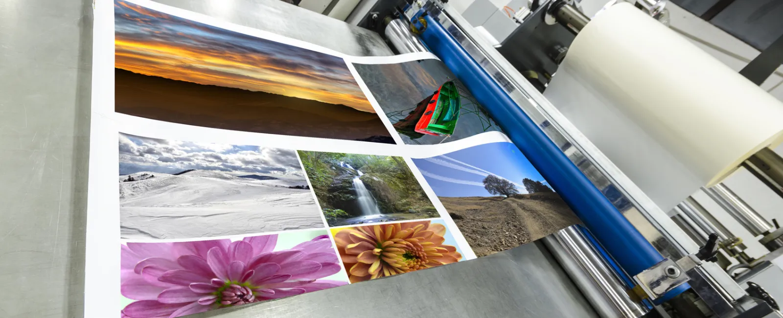
Printing Tips: Paper, Finish, and Quality
Choosing the right paper is crucial for rack card printing. It determines how the card looks and feels. High-quality paper gives a professional appearance, which is essential for any business.
Consider using paper with a good weight. This ensures durability and a premium feel. Customers are more likely to take notice if the card feels substantial.
The finish you select can also impact the visual appeal. A glossy finish can make colors pop and attract attention. Matte finishes, on the other hand, offer an elegant and subtle look.
Each finish has its benefits. Choose one that aligns with your brand and message. Here are a few options to consider:
Glossy: Enhances vibrancy
Matte: Reduces glare
Textured: Adds a unique tactile element
Invest in quality printing to ensure the best results. A well-printed rack card reflects positively on your brand. Poor printing can undermine even the best design efforts.
Placement Strategies: Using Card Display Racks Effectively
The placement of rack cards is crucial for visibility. They should be positioned in high-traffic areas to maximize exposure. Consider locations where people naturally congregate.
Use card display racks to organize and present cards. These racks ensure the cards are easily visible and accessible. Effective use of space can lead to more engagements.
Selecting the right rack for your environment is important. Options vary and can accommodate different design styles and capacities. Here are some popular choices:
Free-standing racks for open spaces
Countertop racks for points of sale
Wall-mounted racks to save floor space
Position your racks at eye level to draw attention. This increases the likelihood that passersby will notice and engage with them. Utilize appealing designs and colors to stand out.
Monitoring the racks frequently is also wise. Replace empty slots and reposition racks as needed. This ensures your cards always look tidy and appealing.
Personalization, Customization, and Eco-Friendly Options
Personalization is key to creating impactful rack cards. Tailor your message to fit the target audience. This approach makes your marketing more effective and memorable.
Customization can enhance this personalization. Adjust colors, fonts, and visuals to align with your brand. Including unique touches can make your cards stand out.
Eco-friendly options are growing in popularity. Many consumers appreciate sustainable business practices. Here are some green choices to consider:
Recycled paper for printing
Soy-based inks for a lower environmental impact
Biodegradable finishes that maintain quality
These choices reflect a company's commitment to the environment. They also appeal to eco-conscious consumers. Making eco-friendly selections can increase your brand's credibility.
Using sustainable options doesn't compromise quality. Modern materials ensure your rack cards remain attractive and durable. This combination of customization and sustainability can lead to a positive brand image.
Measuring Success: Tracking and Improving Rack Card Performance
Measuring the success of your rack card strategy is crucial. Tracking response rates provides valuable insights. Collect data on customer engagement and actions prompted by your cards.
There are several metrics to consider. Look at distribution volume versus conversion rates. This helps identify which locations and layouts perform best.
Here's a list of ways to track performance:
Use QR codes or unique URLs for monitoring
Request customer feedback through surveys
Analyze increased sales or inquiries after distribution
Continuously test new designs and placement strategies. Adapt based on the data you gather. This iterative approach ensures your rack cards remain effective. By regularly assessing performance, you can make informed changes to optimize impact.
Conclusion: Creating Rack Cards That Get Results
Crafting effective rack cards requires attention to detail and creativity. By focusing on design elements like images, headlines, and color, you can capture attention instantly. Each aspect should work harmoniously to convey your message.
Printing quality is equally important. High-quality materials and finishes help ensure your cards look professional and durable, leaving a lasting impression. Don't forget about placement. Utilizing card display racks strategically can enhance visibility and engagement.
Ultimately, your rack card's success depends on ongoing evaluation and adaptation. Measure results consistently and adjust strategies to meet evolving needs. Through thoughtful design and careful monitoring, your rack cards will drive results and elevate your marketing efforts.
If you have a need for custom-printed rack cards, give Formax a call at 866-367-6221, or if you already know your project specs submit our quote request form. We can professionally print, laminate and assemble your flip documents to your exact specifications.
Take care! Rick